Didot Font
The razor-thin Parisian serif of fashion covers
Firmin Didot (1780s); digital versions by Adrian Frutiger and Jonathan Hoefler · Didone (modern) serif · 1784 · ! Bundled with macOS, other cuts paid
Playfair Display · closest free match to Didot
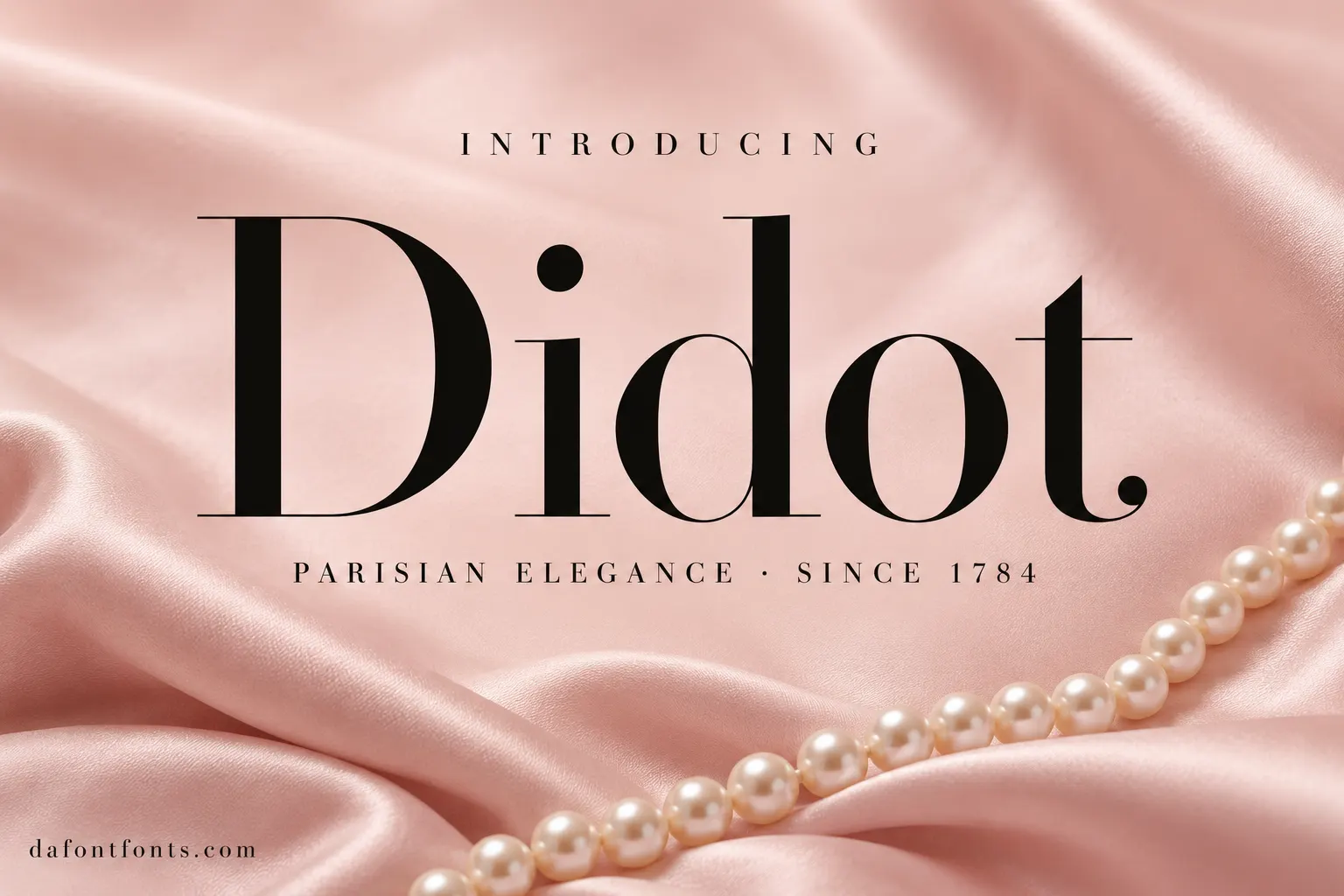
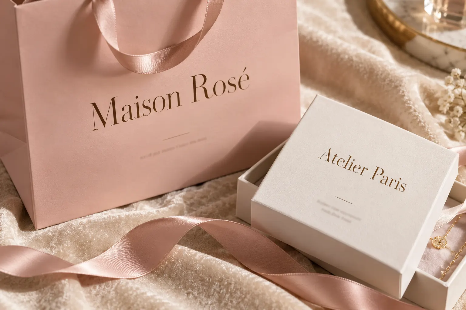
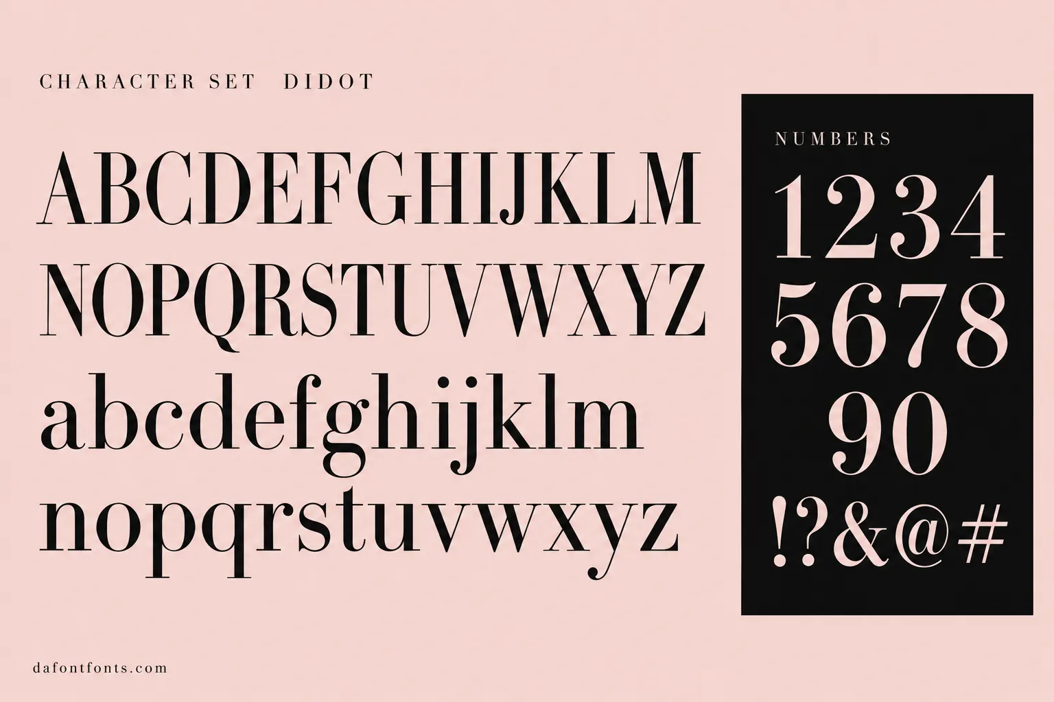
Illustrations of the Didot style made for DaFontFonts. Letterforms are approximate; check the official specimen before you buy.
Download Didot
- License:
- Bundled with macOS, other cuts paid
- Font Type:
- System font
- Download:
- Free alternative: Playfair Display (OFL-1.1)
- Format:
- TTF
- Total Files:
- 12 styles + licence
Didot itself is not free to download. This button gives you Playfair Display, the closest free match, licensed for commercial use. HTF Didot from Hoefler&Co
About Didot
Didot comes from the Didot family of printers and typefounders in Paris. Firmin Didot cut the influential types in the 1780s, at the same time Bodoni was working in Italy, and both pushed serif type toward extreme contrast: hairline serifs, very thin horizontals and a vertical axis. Didot is generally the more delicate and refined of the two.
The best-known digital versions are Linotype Didot, drawn by Adrian Frutiger, and HTF Didot by Jonathan Hoefler, made with many optical sizes for fashion publishing. Apple also ships a Didot on macOS. It is the voice of high fashion: magazine mastheads, couture brands, jewelry and beauty packaging.
Where Didot works best
- Fashion and beauty branding
- Magazine mastheads and covers
- Jewelry and luxury packaging
- Elegant invitations
Free alternatives to Didot
Open-licence fonts with a comparable feel, every one verified free for commercial use and downloadable from DaFontFonts.
Playfair Display is the standard free stand-in for fashion-style mastheads, with high contrast and refined details that photograph well at large sizes. Its bracketed serifs and warmer curves make it gentler than true Didot hairlines.
Prata is a high-contrast didone-influenced display serif with slender hairlines and an elegant, slightly condensed carriage. It ships in a single weight, so it works for headlines rather than full systems.
Bodoni Moda offers genuine unbracketed hairline serifs and optical sizing, the closest free approximation of Didot's engraved sharpness. Its Italian Bodoni proportions are marginally sturdier than Didot's French delicacy.
Italiana is a slim, high-contrast display face with an editorial, magazine-nameplate quality that suits Didot-style branding. It is a single-weight display font with narrow proportions and no italic.
DM Serif Display gives didone contrast in a friendly, contemporary package for headings and logotypes. It is noticeably rounder and less aristocratic than Didot.
Didot is a trademark of its owner. DaFontFonts does not host or distribute the Didot font files; download and licence links go to the official source.
Questions
Is Didot font free?
Mac users get a Didot for their own documents and designs. Linotype Didot and HTF Didot are paid. Playfair Display and Prata are free alternatives you can use on any platform and website.
What font looks like the Vogue logo?
Vogue's look is a Didot-style high-contrast serif. Playfair Display and Bodoni Moda are free fonts that capture the same fashion-magazine feel.
What is the difference between Didot and Bodoni?
Both are high-contrast Didone serifs. Didot is usually lighter and more delicate, with finer hairlines, while Bodoni is a little sturdier.
What is a free alternative to Didot?
Playfair Display is the most popular free Didone. Prata, Italiana and Bodoni Moda are also good choices for elegant headlines.
More popular fonts
- Boomhauer Font
- Gihun Font
- Hyper Font
- Johnny Pistolas Font
- Makayla Font
- Pirate Font
- Aadhunik Font
- Abuget Font
- Adelia Font
- Againts Font
- Alligator Font
- Alte Haas Grotesk Font
- Amalfi Coast Font
- Amarillo Font
- American Captain Font
- Ammanda Font
- Another Danger Font
- Autography Font
- Azonix Font
- Baby Blue Font
- Billabong Font
- Billy Ohio Font
- Birds of Paradise Font
- Black Jack Font
- Blackjack Font
- Boba Panda Font
- Bulletto Killa Font
- Caviar Dreams Font
- Cheri Font
- Chinese Rocks Font
- Cloister Black Font
- Collegiate Font
- Coolvetica Font
- Cream Cake Font
- Darloune Font
- Doctor Glitch Font
- Exmouth Font
- Fiesta Font
- Franklin Cascaes Font
- Freshman Font
- Ghastly Panic Font
- Happy Donuts Font
- Happy Moment Font
- Heading Pro Font
- Hello Font
- Hello Honey Font
- Himsomnia Font
- Hug Me Tight Font
- Jandles Font
- Journey Font
- KG Happy Font
- KG What the Teacher Wants Font
- Krinkes Font
- Lemon Milk Font
- Lucky Boss Font
- Macaroni Font
- Magical Font
- Money Money Font
- Muthiara Font
- Neuropol Font
- Noelan Font
- Nova Quinta Font
- Old London Font
- Orial Font
- Primetime Font
- Rainbow Dreams Font
- Raspoutine Font
- Respective Font
- Rumble Brave Font
- Samarkan Font
- Sareeka Font
- Showtime Font
- Signatie Font
- Stay Wild Font
- Storm Gust Font
- Sweets Smile Font
- The Skinny Font
- Top Secret Font
- Tripleta Font
- VCR OSD Mono Font
- Welcome Font
- Akira Font
- Algerian Font
- Arial Font
- Avant Garde Font
- Avenir Font
- Baskerville Font
- Bauhaus Font
- Benguiat Font
- Bodoni Font
- Brandon Grotesque Font
- Broadway Font
- Brush Script Font
- Calibri Font
- Canela Font
- Caslon Font
- Century Gothic Font
- Clarendon Font
- Comic Sans Font
- Cooper Black Font
- Copperplate Font
- DIN Font
- Edwardian Script Font
- Eurostile Font
- Franklin Gothic Font
- Frutiger Font
- Futura Font
- Garamond Font
- Gill Sans Font
- Gilroy Font
- Gotham Font
- Helvetica Font
- Impact Font
- Minion Pro Font
- Museo Sans Font
- Myriad Pro Font
- Optima Font
- Papyrus Font
- Proxima Nova Font
- Rockwell Font
- Satoshi Font
- SF Pro Font
- Sofia Pro Font
- Tiempos Font
- Times New Roman Font
- Trade Gothic Font
- Trajan Font
- Univers Font
- Verdana Font