Stop Font
A witty, much-copied 1970 display face
Aldo Novarese (Nebiolo) · Futuristic display capitals · 1970 · ! Supplied with Microsoft products
Michroma · closest free match to Stop
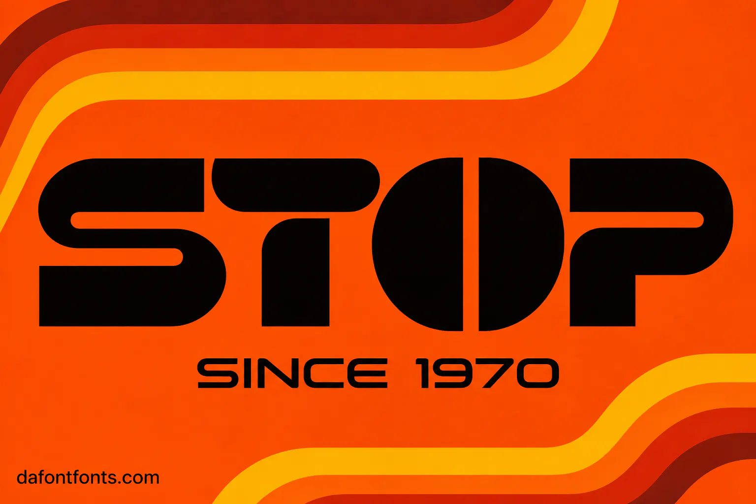
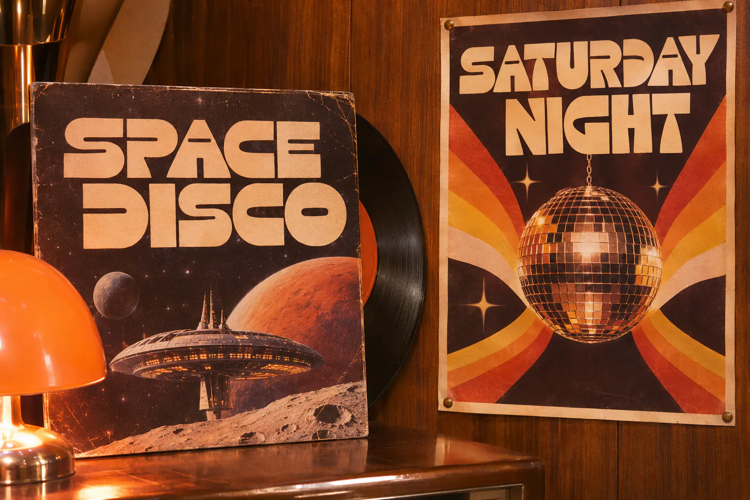
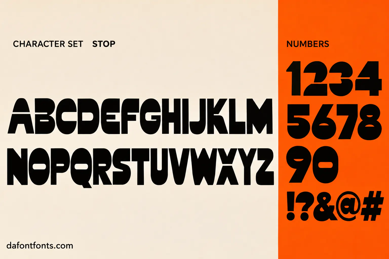
Illustrations of the Stop style made for DaFontFonts. Letterforms are approximate; check the official specimen before you buy.
Download Stop
- License:
- Supplied with Microsoft products
- Font Type:
- System font
- Download:
- Free alternative: Michroma (OFL-1.1)
- Format:
- TTF
- Total Files:
- 1 style + licence
Stop itself is not free to download. This button gives you Michroma, the closest free match, licensed for commercial use. Stop on Microsoft Typography
About Stop
Microsoft says there isn’t a lot of humour in type design, but Stop makes up for it. It came from Nebiolo, the best-known Italian type foundry, in 1970, and was designed by Aldo Novarese.
Its heavy capitals have parts cut away, so each letter is suggested rather than fully drawn, giving a striking futuristic look. Microsoft notes the idea was so irresistible that it was copied again and again, and its version goes back to the earliest use. It is perfect for 1970s, sci-fi and disco designs and short logos.
Where Stop works best
- 1970s retro designs
- Sci-fi and space themes
- Disco and music posters
- Short logos
Free alternatives to Stop
Open-licence fonts with a comparable feel, every one verified free for commercial use and downloadable from DaFontFonts.
Audiowide is a free futuristic display font.
Monoton brings a retro 1970s feel.
Syncopate gives a wide, futuristic look.
Michroma is clean and space-age.
Russo One is bold and techy.
Stop is a trademark of its owner. DaFontFonts does not host or distribute the Stop font files; download and licence links go to the official source.
Questions
Is the Stop font free?
It is free to use where Microsoft installed it, for documents and graphics you create. It is not free to share or use as a web font. Audiowide and Monoton are free alternatives.
Who designed Stop?
Aldo Novarese at the Italian foundry Nebiolo, in 1970.
Why does Stop look broken?
Parts of each heavy capital are cut away, so the letters are suggested rather than fully drawn.
How do I get Stop?
Look for Stop in the font list of Word or Publisher; it came with some Microsoft Office versions. If it is missing, you can license it from a font vendor.
More popular fonts
- Abril Display Font
- Adelle Sans Font
- Adobe Jenson Font
- Adobe Text Font
- Atlas Grotesk Font
- Basis Grotesque Font
- Baskerville Old Face Font
- Bebas Kai Font
- Bookmania Font
- Boxing Font
- Bree Font
- Brioso Font
- Brother 1816 Font
- Bw Nista Font
- Bw Vivant Font
- Chaparral Font
- Comico Font
- Cronos Font
- Editorial New Font
- Engravers Gothic Font
- Expose Font
- Favorit Font
- Filosofia Font
- Freight Display Font
- Freight Sans Font
- Garamond Premier Font
- Gibson Font
- Gill Sans Nova Font
- Gilmer Font
- Ginto Font
- GT Alpina Font
- GT Eesti Font
- GT Flexa Font
- GT Maru Font
- GT Standard Font
- GT Ultra Font
- Halyard Font
- Helvetica Neue Font
- HK Grotesk Font
- ITC Korinna Font
- ITC Tiffany Font
- Ivy Mode Font
- Kola Font
- Lab Grotesque Font
- Mr Eaves Font
- Museo Slab Font
- Neue Machina Font
- Neue Plak Font
- New Title Font
- Nexa Rust Font
- Nobel Font
- Obviously Font
- Quarto Font
- Rosaline Font
- RX100 Font
- Skolar Font
- Sofia Pro Soft Font
- Tabular Font
- Termina Font
- TT Chocolates Font
- TT Firs Neue Font
- TT Fors Font
- TT Hoves Font
- TT Interphases Font
- TT Octosquares Font
- TT Ramillas Font
- TT Rounds Neue Font
- TT Supermolot Neue Font
- TT Trailers Font
- TT Travels Font
- University Roman Font
- Warnock Font
- Acherus Grotesque Font
- Aeonik Font
- Alpino Font
- Amulya Font
- Arboria Font
- Array Font
- Author Font
- Bespoke Sans Font
- Bespoke Serif Font
- Bonny Font
- Boska Font
- Britney Font
- Bw Gradual Font
- Bw Modelica Font
- Cabinet Grotesk Font
- Chillax Font
- Chronicle Font
- Clash Display Font
- Clash Grotesk Font
- Coco Gothic Font
- Corsa Grotesk Font
- Decimal Font
- Domaine Font
- Effra Font
- Erode Font
- Excon Font
- Filson Pro Font
- Founders Grotesk Font
- Freight Text Font
- Galano Grotesque Font
- Gambarino Font
- Gambetta Font
- General Sans Font
- GT America Font
- GT Sectra Font
- GT Super Font
- GT Walsheim Font
- Handel Gothic Font
- Hoover Font
- Ideal Sans Font
- Idlewild Font
- ITC Serif Gothic Font
- Lyon Font
- Melodrama Font
- Mercury Font
- Museo Sans Rounded Font
- Neco Font
- Neue Haas Unica Font
- Nippo Font
- Ogg Font
- Operator Mono Font
- Orator Font
- Pally Font
- Panchang Font
- Pilcrow Rounded Font
- Plein Font
- Proxima Soft Font
- Quilon Font
- Ranade Font
- Recia Font
- Rowan Font
- Sassoon Font
- Segment Font
- Sentient Font
- Sharpie Font
- Söhne Font
- Stardom Font
- Styro Font
- Suisse Int’l Font
- Supreme Font
- Surveyor Font
- Switzer Font
- Synonym Font
- Tanker Font
- Technor Font
- Telma Font
- TT Lakes Font
- Untitled Sans Font
- Vitesse Font
- Zina Font
- Zodiak Font
- Abadi Font
- Acumin Font
- Adelle Font
- Adobe Garamond Pro Font
- Agency FB Font
- Aktiv Grotesk Font
- Akzidenz-Grotesk Font
- Albertus Font
- American Typewriter Font
- American Uncial Font
- Andale Mono Font
- Anurati Font
- Apercu Font
- Aptos Font
- Archer Font
- Augsburger Initials Font
- Avenir Next Font
- Bahnschrift Font
- Bank Gothic Font
- Beesknees ITC Font
- Bell MT Font
- Bembo Font
- Benton Sans Font
- Berlin Sans FB Font
- Bernard MT Condensed Font
- Bickham Script Font
- Bickley Script Font
- Biome Font
- Book Antiqua Font
- Bookman Old Style Font
- Bradley Hand ITC Font
- Braggadocio Font
- Brandon Text Font
- Britannic Bold Font
- Brown Font
- Calibre Font
- Californian FB Font
- Calisto MT Font
- Calluna Font
- Cambria Font
- Campton Font
- Candara Font
- Castellar Font
- Cavolini Font
- Centaur Font
- Century Font
- Century Schoolbook Font
- Cera Pro Font
- Cheltenham Font
- Circular Font
- Cochin Font
- Colonna MT Font
- Consolas Font
- Constantia Font
- Contemporary Brush Font
- Corbel Font
- Dante Font
- Daytona Font
- Desdemona Font
- Druk Font
- Eckmann Font
- Edda Font
- Elephant Font
- Engravers MT Font
- Enviro Font
- Eras ITC Font
- Felix Titling Font
- FF Mark Font
- FF Meta Font
- Fine Hand Font
- Flexure Font
- Forte Font
- Freestyle Script Font
- French Script MT Font
- Friz Quadrata Font
- Gabriola Font
- Gigi Font
- Gotham Narrow Font
- Gotham Rounded Font
- Goudy Old Style Font
- Goudy Stout Font
- Gradl Font
- Graphik Font
- Haettenschweiler Font
- Harlow Solid Italic Font
- Harrington Font
- High Tower Text Font
- Hoefler Text Font
- Imprint MT Shadow Font
- Informal Roman Font
- Ink Free Font
- Interstate Font
- ITC Officina Sans Font
- Juice ITC Font
- Kabel Font
- Kino MT Font
- Knockout Font
- Korolev Font
- Kristen ITC Font
- Kunstler Script Font
- LCD Font
- Lucida Blackletter Font
- Lucida Bright Font
- Lucida Calligraphy Font
- Lucida Console Font
- Lucida Fax Font
- Lucida Sans Font
- Lucida Sans Typewriter Font
- Lulo Font
- Magneto Font
- Maiandra GD Font
- Mallory Font
- Marker Felt Font
- Matisse ITC Font
- Matura MT Script Capitals Font
- Mead Bold Font
- Menlo Font
- Mercurius Script MT Bold Font
- Microgramma Font
- Microsoft Sans Serif Font
- Migra Font
- Mistral Font
- Modern Love Font
- Monotype Corsiva Font
- Monument Extended Font
- Mrs Eaves Font
- MV Boli Font
- Neue Haas Grotesk Font
- Neue Montreal Font
- New Caledonia Font
- New York Font
- News Gothic MT Font
- Niagara Font
- Object Sans Font
- OCR A Extended Font
- OCR-B Font
- Onyx Font
- Palace Script MT Font
- Palatino Linotype Font
- Parade Font
- Parchment Font
- Peignot Font
- Perpetua Font
- Placard Condensed Font
- Playbill Font
- Poor Richard Font
- Posterama Font
- Quire Sans Font
- Rage Italic Font
- Ransom Font
- Runic MT Condensed Font
- Sabon Font
- Sagona Font
- Script MT Bold Font
- Segoe Print Font
- Segoe Script Font
- Sentinel Font
- Sitka Font
- Snap ITC Font
- Snell Roundhand Font
- Souvenir Font
- Stencil Font
- Sylfaen Font
- Tempo Grunge Font
- Tempus Sans ITC Font
- The Hand Font
- The Serif Hand Font
- Tisa Font
- TT Commons Font
- TT Norms Pro Font
- Tungsten Font
- Tw Cen MT Font
- Uni Sans Font
- Verlag Font
- Viner Hand ITC Font
- Vladimir Script Font
- Walbaum Font
- Westminster Font
- Whitney Font
- Wide Latin Font
- Zapf Chancery Font
- Zapfino Font
- Blackadder ITC Font
- Burbank Font
- Chiller Font
- Courier New Font
- Curlz MT Font
- Georgia Font
- Jokerman Font
- Lucida Handwriting Font
- Neutraface Font
- Old English Text MT Font
- Pristina Font
- Ravie Font
- Segoe UI Font
- Showcard Gothic Font
- Tahoma Font
- Trebuchet MS Font
- Vivaldi Font
- 1942 Report Font
- Amore Christmas Font
- Anja Eliane Font
- Army Rust Font
- Beach Sound Font
- Bigtimes Font
- Breath of the House Font
- Cheeky Rabbit Font
- Classique Script Font
- Darling Font
- Digital Strip Font
- Don Graffiti Font
- Du Bellay Font
- Elegante Font
- Evil Scratch Font
- Evogria Font
- Forever Brush Font
- Frightmare Font
- Gemstone Font
- Golden Hills Font
- Golden Varsity Font
- Gothic War Font
- Greek Freak Font
- Halloween Font
- Hidayatullah Font
- Honeymoon Font
- Inked God Font
- Kindergarten Font
- Lamoric Rowen Font
- Lets Get Crazy Font
- Love Font
- Love Font
- MADE Sunflower Font
- Mainstay Font
- Maximum Voltage Font
- Melt Font
- Mermaid Font
- One Slice Font
- Punk Typewriter Font
- Quentin Font
- Roman SD Font
- Rush Driver Font
- Sectar Font
- Slowly Move Font
- Sports World Font
- Stencilia Font
- Sunny Spells Font
- Super Dream Font
- Superstar M54 Font
- Thankfull Font
- Type Machine Font
- Upheaval Font
- Vectipede Font
- Vinque Antique Font
- A Dripping Marker Font
- Bad Grunge Font
- Bethany Elingston Font
- Billo Font
- Blackrush Font
- Blood Victim Font
- Breathing Font
- Bromello Font
- Caramel and Vanilla Font
- Catalish Huntera Font
- Cherish Font
- Chocolate Crispy Font
- Cute Dino Font
- Deutsch Gothic Font
- Fighting Spirit Font
- Good Brush Font
- Highway Gothic Font
- Ice Cream Font
- Janda Manatee Font
- Kawaii Stitch Font
- Letters for Learners Font
- Long Shot Font
- Magical Feather Font
- Matcha Mint Font
- Mostwasted Font
- Nulshock Font
- Paint Brush Script Font
- Peanut Butter Font
- Sigana Font
- Signatrue Font
- Vividly Font
- Yellow Style Font
- 212 Baby Girl Font
- A4 Speed Font
- Aerosoldier Font
- Agatho Font
- Airstrike Font
- Angelic Pearl Font
- April Font
- Athletic Font
- Aurora Font
- Aurora Pro Font
- Avigea Font
- Bacalisties Font
- Bakso Sapi Font
- Barber Chop Font
- Basketball Font
- Better Together Font
- Bettermilk Font
- Big Noodle Titling Font
- Biro Script Font
- Black Chancery Font
- Black Mustang Font
- Blood Crow Font
- Break Brush Font
- Bronco Font
- Brusher Font
- Bubblegum Font
- Bucklane Script Font
- Built Titling Font
- Calligraphy Font
- Campus Font
- Candlescript Font
- Candy Beans Font
- Capture It Font
- Cathalia Font
- Champagne & Limousines Font
- Chocolate Font
- Chopin Script Font
- Chopsic Font
- Classy Vogue Font
- Coconut Island Font
- College Font
- College Block Font
- Conthrax Font
- Curse of the Zombie Font
- Daily Font
- Daughter of Fortune Font
- Digital-7 Font
- Dream Orphans Font
- Elegant Typewriter Font
- Eternalo Font
- Faith Font
- Faith Collapsing Font
- Fat Kat Font
- Flame On Font
- Floraison des Amours Font
- Funland Font
- Gang of Three Font
- Genty Font
- Glamour Font
- Gontserrat Font
- Good Times Font
- Gossamer Noon Sans Font
- Graffiti Youth Font
- Grime Slime Font
- Halloween Font
- High Spirited Font
- Hoshiko Satsuki Font
- Huglove Font
- Im Joking Font
- Jheri Curls Font
- Jraot Font
- Kathen Font
- Kenyan Coffee Font
- KG Primary Penmanship Font
- Leander Font
- Learning Curve Font
- Lostar Font
- Louis George Cafe Font
- LSD Party Club Font
- Made Tommy Font
- Magic Retro Font
- Magic Sound Font
- Magnificent Serif Font
- Mayonice Font
- Michland Font
- Mieszkanie9 Font
- Milkshake Creps Font
- Milton One Font
- Miracle History Font
- Modern Prestige Font
- Moderniz Font
- Mom's Typewriter Font
- Monster Clubhouse Font
- Nasalization Font
- October Crow Font
- Old Newspaper Types Font
- OpenDyslexic Font
- Oups Font
- Panton Font
- Photography Font
- Pixelta Font
- Platinum Sign Font
- Please Write Me a Song Font
- Race Sport Font
- Racing in the Rain Font
- Retro Signature Font
- Saint Carell Font
- Sanguine Frost Font
- Shlop Font
- Signatra Font
- Splatink Font
- Spooky Monster Font
- Starbim Font
- Steelfish Font
- Sunday Best Font
- Super Histories Font
- The Augusta Font
- The Inquisition Font
- The Rules of the Game Font
- Thesignature Font
- Velista Font
- Verve Font
- Whimsical Font
- White On Black Font
- Wintery Christmas Font
- Acidic Font
- Adelia (Carroline Typography) Font
- Against Font
- Always Classy Font
- Always in the Star Font
- Amichan Font
- Amoria Font
- Anak Gedong Font
- Angel Wish Font
- Anime Ace BB Font
- Another Tag Font
- Aquiline Two Font
- Aster Font
- Aston Script Font
- Atarashi Font
- Avermont House Font
- Babydoll Font
- Baleday Font
- Balleys Font
- Bannie Font
- Begal Font
- Bestro Font
- Big Larian Customs Font
- Billa Mount Font
- Billie Kimber Font
- Bing Boss Font
- Blabbermouth Font
- Blackflag Font
- Blacklisted Font
- Blacksword Font
- Blagkine Font
- Bleeding Cowboys Font
- Boomhauer Font
- Bounce Dash Font
- Bouncy Font
- Bremlin Font
- Bright Sunlist Font
- Bright Sunshine Font
- Brighton Font
- Brittany Signature Font
- Brother Signature Font
- Brunson Font
- Building Font
- Butterpop Font
- Buttons & Patches Font
- Campana Script Font
- CF Halloween Font
- Cherolina Font
- Chicken Pie Font
- Childer Font
- Cintaku Font
- Cocogoose Font
- Cowboy Movie Font
- Creato Display Font
- Cricket Script Font
- Cuatra Font
- Danger Zone Warning Font
- Dantene Font
- Daustley Font
- Debug Font
- Del Rose Font
- Designer Font
- DK Jambo Font
- Drunk Clown Font
- Duhai Font
- Eccentric Font
- Edo SZ Font
- Elasis Font
- Emily Street Font
- Ethnocentric Font
- Evantic Font
- Family Annihilator Font
- First Encounter Font
- Flowers Kingdom Font
- Fortune Coin Font
- Gashina Beauty Font
- Gihun Font
- Goldy Burst Font
- Gothik Steel Font
- Gravity Points Font
- Griffiths Font
- Grobold Font
- Handies Font
- Hanging Letters Font
- Heavitas Font
- Hello Baby Font
- Hello Valentica Font
- Heran Font
- Hey Comic Font
- Heyam Font
- Histea Ballon Font
- Histore Magica Font
- Honey Bunny Font
- Hyper Font
- Impacted Font
- Inked Skin Font
- Internet Friends Font
- Jane Austen Font
- Jersey M54 Font
- JMH Typewriter Font
- Johnny Pistolas Font
- Josephsophia Font
- Ka-Boing! Font
- Keepsmile Font
- KG Perfect Penmanship Font
- KG Primary Dots Font
- KG Red Hands Font
- Kids Magazine Font
- Kinemon Font
- Komika Axis Font
- Lemon Slice Font
- Loverine Font
- Madina Font
- Magdelin Font
- Makayla Font
- Manga Style Font
- Manga Temple Font
- Manyland Font
- Marola Font
- Matcha Home Font
- Matcha World Font
- Merosa Font
- Milany Font
- Milesdane Font
- Milky Matcha Font
- Minnio Font
- Mistical Spring Font
- Monday Special Font
- Monimer Serif Font
- Mont Font
- Nahla Script Font
- Natalie Caydence Font
- New Kids Font
- New Romantics Font
- Nexa Font
- Nordic Font
- Papernotes Font
- Pepperland Font
- Photograph Signature Font
- Pirate Font
- Precious Way Font
- Rascal Font
- Rasley Heights Font
- Recoleta Font
- Relationship of Mélodrame Font
- Retro Music Font
- Road Rage Font
- Roffelia Font
- Sambosa Font
- Scary Halloween Font
- Scrubadoo Font
- Sephora & Hayden Font
- Sequel Font
- Seramonde Font
- Shadow of the Deads Font
- Shorebreak Script Font
- Simple Handmade Font
- Simply Olive Font
- Slowing Font
- Smile Moon Font
- Snowball (Magical Snowball) Font
- Softball Font
- Soopafresh Font
- Sorean Font
- Spookyy Font
- Starborn Font
- Stay With Me Font
- Stretch Pro Font
- Sunday Ginger Font
- Super Chips Font
- Super Waffles Font
- Supersonic Rocketship Font
- Svetze Font
- Taste Bread Font
- Tempting Font
- The Black Dahlia Font
- The Bold Font Font
- The Magic Cookie Font
- The Punk Grandmother Font
- The Wildeast Font
- Tiki Font
- Tritopani Font
- Tropi Land Font
- Urban Heroes Font
- Vampire Wars Font
- Varsity Team Font
- Velomino Font
- Verandah Reverie Font
- Void Font
- Welcome December Font
- Welcome Ramadhan Font
- Winkle Font
- Yellow Banana Font
- Yupita Font
- Aadhunik Font
- Abuget Font
- Adelia Font
- Againts Font
- Alligator Font
- Alte Haas Grotesk Font
- Amalfi Coast Font
- Amarillo Font
- American Captain Font
- Ammanda Font
- Another Danger Font
- Autography Font
- Azonix Font
- Baby Blue Font
- Billabong Font
- Billy Ohio Font
- Birds of Paradise Font
- Black Jack Font
- Blackjack Font
- Boba Panda Font
- Bulletto Killa Font
- Caviar Dreams Font
- Cheri Font
- Chinese Rocks Font
- Cloister Black Font
- Collegiate Font
- Coolvetica Font
- Cream Cake Font
- Darloune Font
- Doctor Glitch Font
- Exmouth Font
- Fiesta Font
- Franklin Cascaes Font
- Freshman Font
- Ghastly Panic Font
- Happy Donuts Font
- Happy Moment Font
- Heading Pro Font
- Hello Font
- Hello Honey Font
- Himsomnia Font
- Hug Me Tight Font
- Jandles Font
- Journey Font
- KG Happy Font
- KG What the Teacher Wants Font
- Krinkes Font
- Lemon Milk Font
- Lucky Boss Font
- Macaroni Font
- Magical Font
- Money Money Font
- Muthiara Font
- Neuropol Font
- Noelan Font
- Nova Quinta Font
- Old London Font
- Orial Font
- Primetime Font
- Rainbow Dreams Font
- Raspoutine Font
- Respective Font
- Rumble Brave Font
- Samarkan Font
- Sareeka Font
- Showtime Font
- Signatie Font
- Stay Wild Font
- Storm Gust Font
- Sweets Smile Font
- The Skinny Font
- Top Secret Font
- Tripleta Font
- VCR OSD Mono Font
- Welcome Font
- Akira Font
- Algerian Font
- Arial Font
- Avant Garde Font
- Avenir Font
- Baskerville Font
- Bauhaus Font
- Benguiat Font
- Bodoni Font
- Brandon Grotesque Font
- Broadway Font
- Brush Script Font
- Calibri Font
- Canela Font
- Caslon Font
- Century Gothic Font
- Clarendon Font
- Comic Sans Font
- Cooper Black Font
- Copperplate Font
- Didot Font
- DIN Font
- Edwardian Script Font
- Eurostile Font
- Franklin Gothic Font
- Frutiger Font
- Futura Font
- Garamond Font
- Gill Sans Font
- Gilroy Font
- Gotham Font
- Helvetica Font
- Impact Font
- Minion Pro Font
- Museo Sans Font
- Myriad Pro Font
- Optima Font
- Papyrus Font
- Proxima Nova Font
- Rockwell Font
- Satoshi Font
- SF Pro Font
- Sofia Pro Font
- Tiempos Font
- Times New Roman Font
- Trade Gothic Font
- Trajan Font
- Univers Font
- Verdana Font