Tiempos Font
Klim's contemporary editorial serif for text and headlines
Kris Sowersby · Transitional serif · 2010 · × Paid license, free test fonts
Source Serif 4 · closest free match to Tiempos
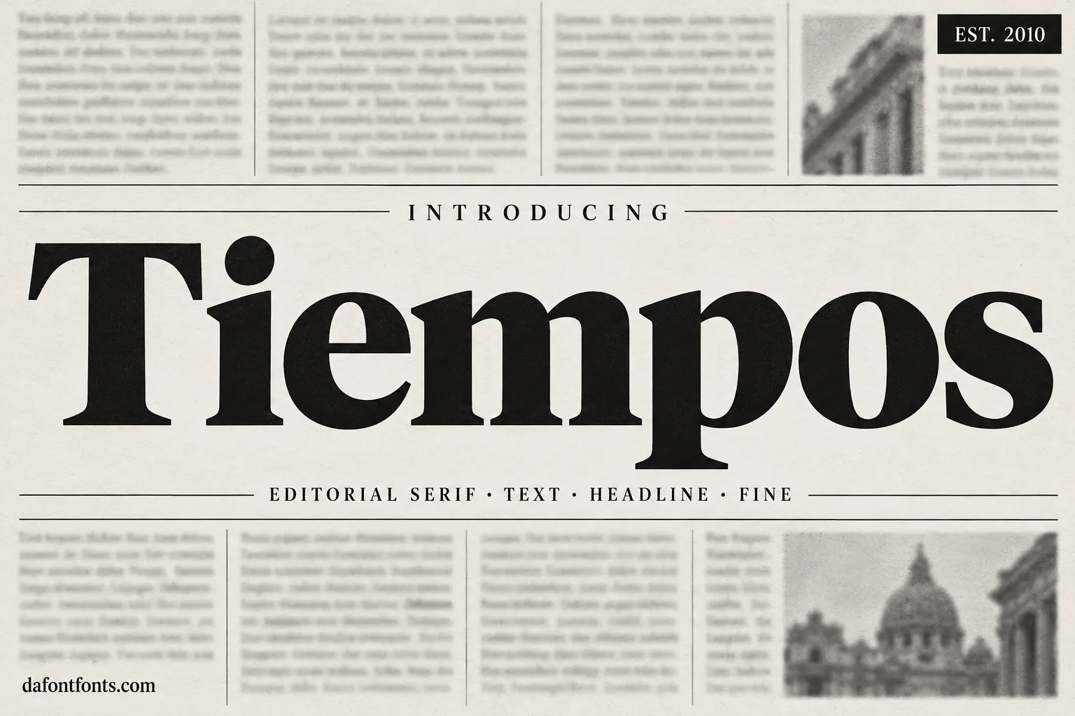
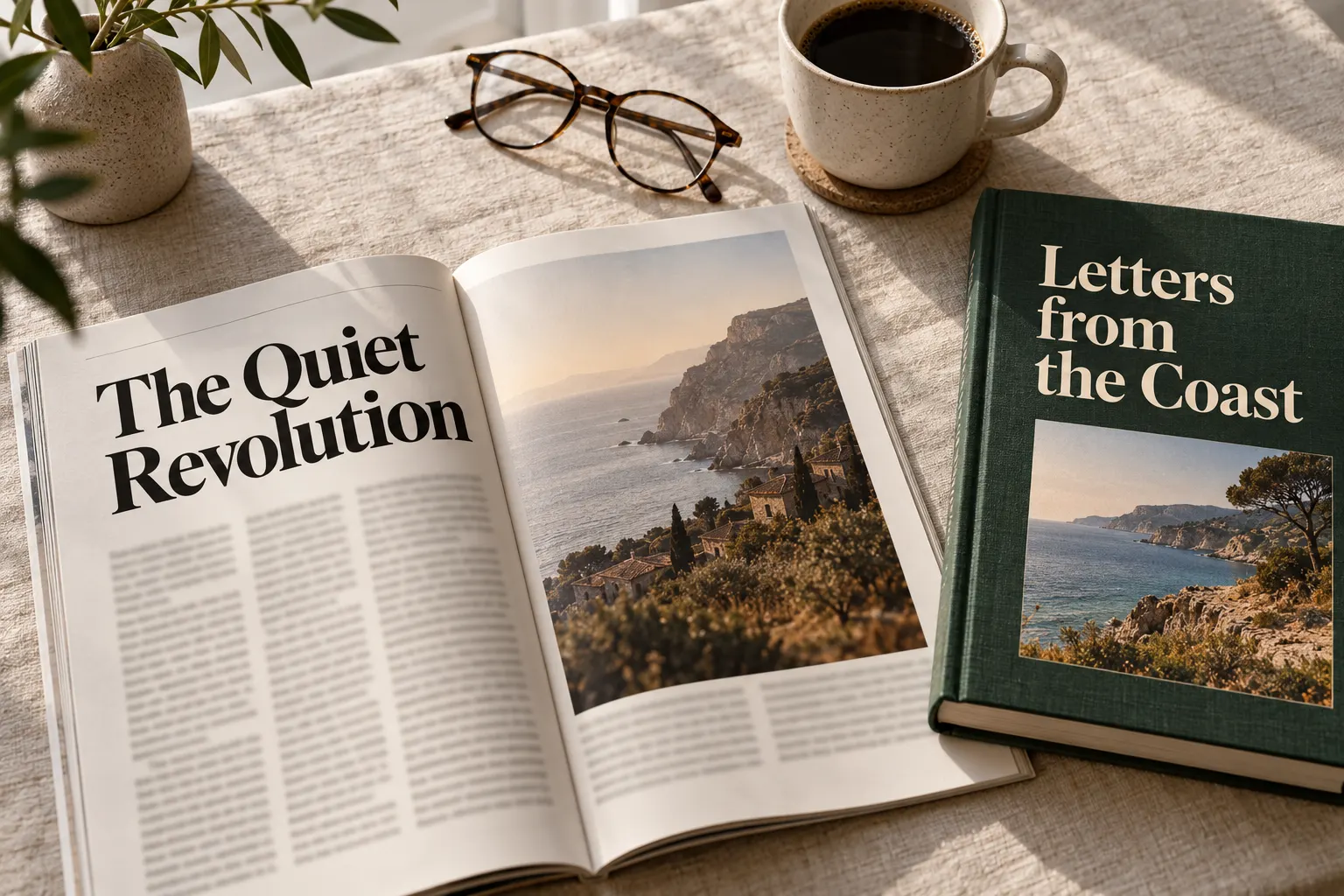
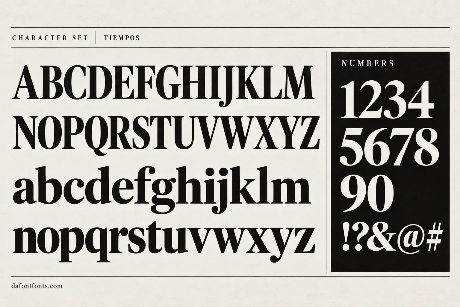
Illustrations of the Tiempos style made for DaFontFonts. Letterforms are approximate; check the official specimen before you buy.
Download Tiempos
- License:
- Paid license, free test fonts
- Font Type:
- Paid
- Download:
- Free alternative: Source Serif 4 (OFL-1.1)
- Format:
- TTF
- Total Files:
- 16 styles + licence
Tiempos itself is not free to download. This button gives you Source Serif 4, the closest free match, licensed for commercial use. Buy Tiempos from Klim
About Tiempos
Tiempos was designed by Kris Sowersby at Klim Type Foundry in New Zealand and released in 2010, with engineering by Noe Blanco. Klim describes Tiempos Text as taking the functionality of Plantin and Times and gently updating it for contemporary use. Tiempos Headline followed for large sizes, and Tiempos Fine arrived in 2018 for very large, delicate display settings.
The text cut is sturdy and economical, with a generous x-height, firm serifs and compact proportions that keep long articles readable on paper and screens. The headline and fine cuts sharpen the contrast and tighten the spacing, so the family can run a whole publication from captions to cover lines. That versatility made Tiempos a favourite of newsrooms, magazines and product sites that want a serious, editorial voice.
Where Tiempos works best
- Newspapers and magazines
- Long-form articles and blogs
- Book typography
- Editorial product and brand sites
Free alternatives to Tiempos
Open-licence fonts with a comparable feel, every one verified free for commercial use and downloadable from DaFontFonts.
Source Serif 4 is the closest free match for Tiempos Text: a sturdy transitional serif with optical sizes, built for long reading on screen and paper.
Newsreader was drawn specifically for news reading, with display and text optical sizes that echo the Tiempos Text and Headline split.
Literata is a contemporary book serif with a large weight range and italics, a dependable free substitute for long-form Tiempos settings.
Spectral is a refined screen-first serif with crisp details, a good match for the lighter, more elegant Tiempos Headline and Fine cuts.
Gelasio is metric-compatible with Georgia and has a solid, readable texture, useful when you want a Tiempos-like serif that drops into existing layouts.
Tiempos is a trademark of its owner. DaFontFonts does not host or distribute the Tiempos font files; download and licence links go to the official source.
Questions
Is Tiempos font free?
No. Tiempos is a paid family from Klim Type Foundry. Klim offers free test fonts for trying it in layouts, but those cannot be used in published or commercial work.
What is the difference between Tiempos Text and Tiempos Headline?
Tiempos Text is built for body copy, with sturdy serifs and roomy spacing. Tiempos Headline is drawn for large sizes, with sharper contrast and tighter spacing. Tiempos Fine goes further for very large display use.
What is a free alternative to Tiempos?
Source Serif 4 and Newsreader are the closest free alternatives. Both have text and display optical sizes and are licensed for commercial use.
Who designed Tiempos?
Tiempos was designed by Kris Sowersby, founder of Klim Type Foundry in Wellington, New Zealand, with engineering by Noe Blanco.
More popular fonts
- Boomhauer Font
- Gihun Font
- Hyper Font
- Johnny Pistolas Font
- Makayla Font
- Pirate Font
- Aadhunik Font
- Abuget Font
- Adelia Font
- Againts Font
- Alligator Font
- Alte Haas Grotesk Font
- Amalfi Coast Font
- Amarillo Font
- American Captain Font
- Ammanda Font
- Another Danger Font
- Autography Font
- Azonix Font
- Baby Blue Font
- Billabong Font
- Billy Ohio Font
- Birds of Paradise Font
- Black Jack Font
- Blackjack Font
- Boba Panda Font
- Bulletto Killa Font
- Caviar Dreams Font
- Cheri Font
- Chinese Rocks Font
- Cloister Black Font
- Collegiate Font
- Coolvetica Font
- Cream Cake Font
- Darloune Font
- Doctor Glitch Font
- Exmouth Font
- Fiesta Font
- Franklin Cascaes Font
- Freshman Font
- Ghastly Panic Font
- Happy Donuts Font
- Happy Moment Font
- Heading Pro Font
- Hello Font
- Hello Honey Font
- Himsomnia Font
- Hug Me Tight Font
- Jandles Font
- Journey Font
- KG Happy Font
- KG What the Teacher Wants Font
- Krinkes Font
- Lemon Milk Font
- Lucky Boss Font
- Macaroni Font
- Magical Font
- Money Money Font
- Muthiara Font
- Neuropol Font
- Noelan Font
- Nova Quinta Font
- Old London Font
- Orial Font
- Primetime Font
- Rainbow Dreams Font
- Raspoutine Font
- Respective Font
- Rumble Brave Font
- Samarkan Font
- Sareeka Font
- Showtime Font
- Signatie Font
- Stay Wild Font
- Storm Gust Font
- Sweets Smile Font
- The Skinny Font
- Top Secret Font
- Tripleta Font
- VCR OSD Mono Font
- Welcome Font
- Akira Font
- Algerian Font
- Arial Font
- Avant Garde Font
- Avenir Font
- Baskerville Font
- Bauhaus Font
- Benguiat Font
- Bodoni Font
- Brandon Grotesque Font
- Broadway Font
- Brush Script Font
- Calibri Font
- Canela Font
- Caslon Font
- Century Gothic Font
- Clarendon Font
- Comic Sans Font
- Cooper Black Font
- Copperplate Font
- Didot Font
- DIN Font
- Edwardian Script Font
- Eurostile Font
- Franklin Gothic Font
- Frutiger Font
- Futura Font
- Garamond Font
- Gill Sans Font
- Gilroy Font
- Gotham Font
- Helvetica Font
- Impact Font
- Minion Pro Font
- Museo Sans Font
- Myriad Pro Font
- Optima Font
- Papyrus Font
- Proxima Nova Font
- Rockwell Font
- Satoshi Font
- SF Pro Font
- Sofia Pro Font
- Times New Roman Font
- Trade Gothic Font
- Trajan Font
- Univers Font
- Verdana Font