Gotham Font
The geometric sans that carried the 2008 Obama campaign
Tobias Frere-Jones · Geometric sans serif · 2000 · × Paid license only
Montserrat · closest free match to Gotham
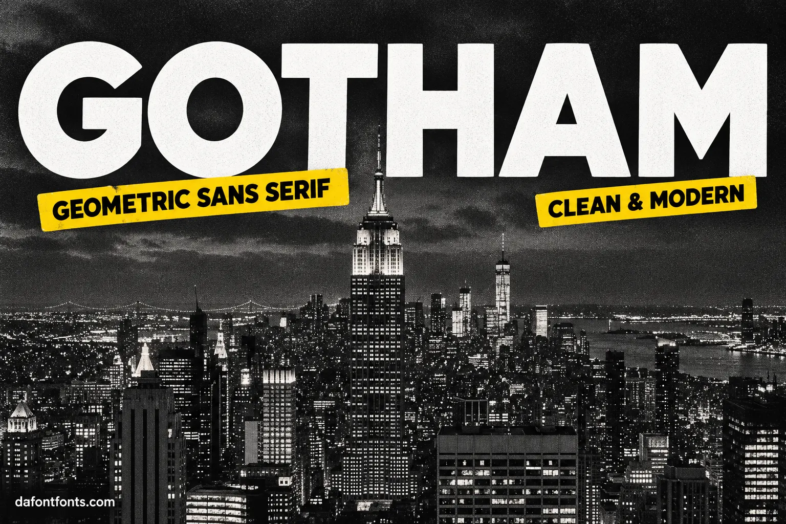
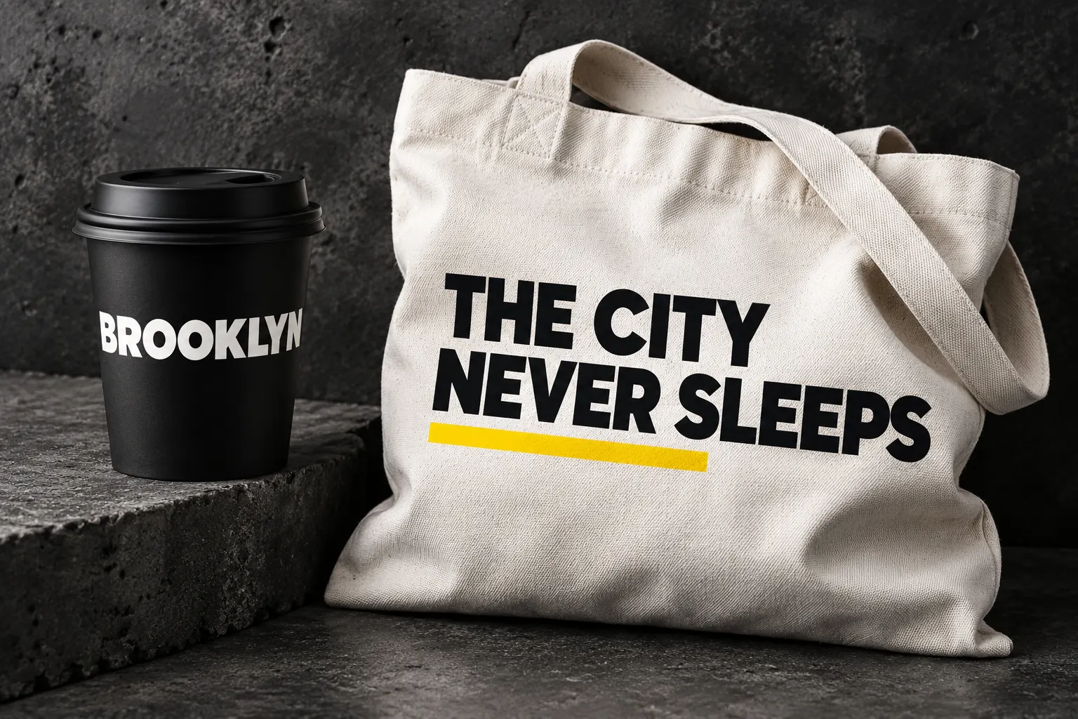
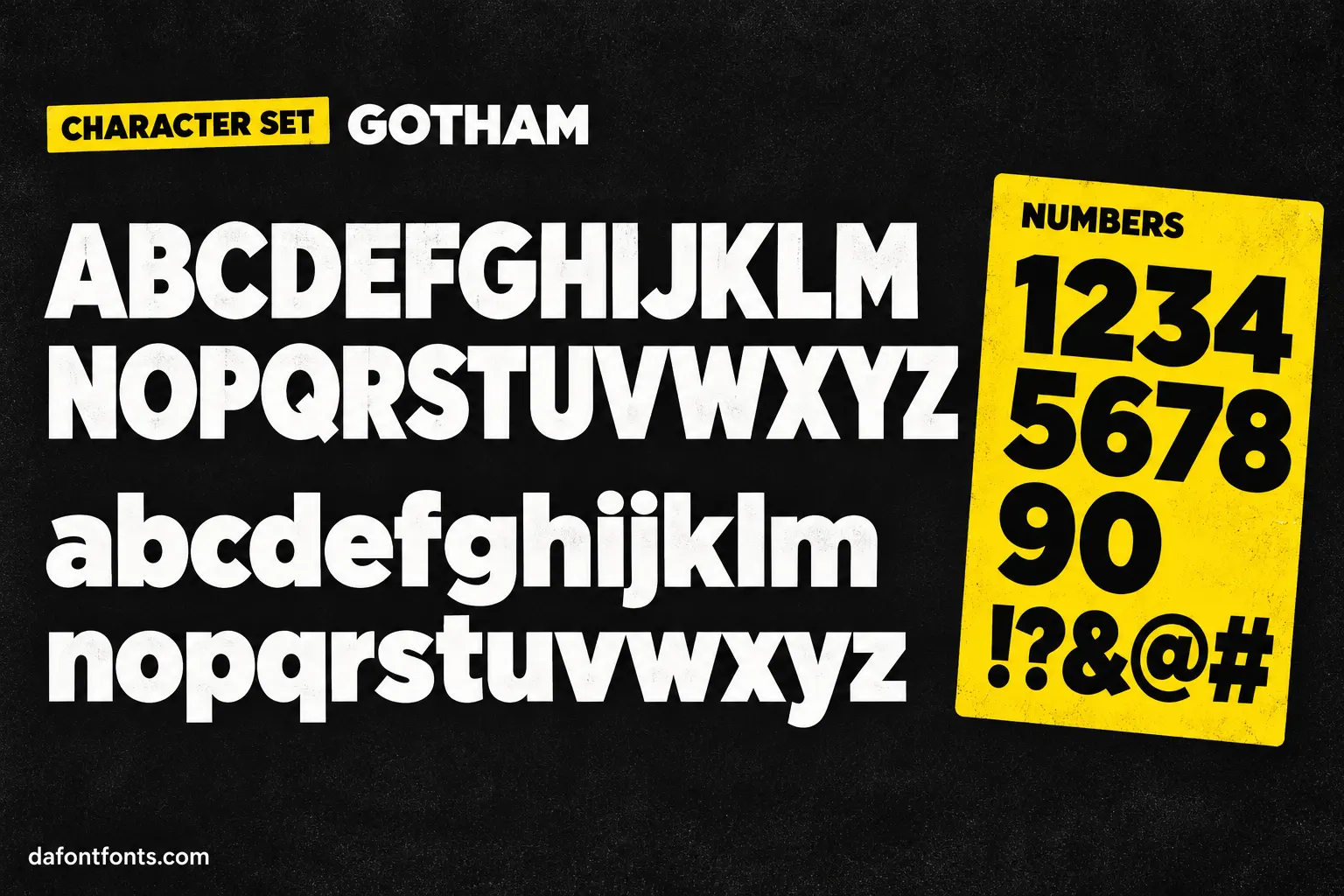
Illustrations of the Gotham style made for DaFontFonts. Letterforms are approximate; check the official specimen before you buy.
Download Gotham
- License:
- Paid license only
- Font Type:
- Paid
- Download:
- Free alternative: Montserrat (OFL-1.1)
- Format:
- TTF
- Total Files:
- 18 styles + licence
Gotham itself is not free to download. This button gives you Montserrat, the closest free match, licensed for commercial use. Buy Gotham from Hoefler&Co
About Gotham
Gotham was drawn by Tobias Frere-Jones and released by Hoefler & Frere-Jones in 2000, after GQ magazine asked for a sans serif that felt masculine, new and familiar at once. Frere-Jones based it on the hand-built lettering of mid-century New York, the kind painted on bus terminals and engineering signs by people who were not type designers, which is why its capitals look sturdy and plain-spoken rather than precious.
The letters are wide and evenly weighted, with a round O, generous counters and flat stroke endings. That combination reads clearly at a distance and holds its shape in very heavy weights, so it took over headlines, logos and signage through the 2000s. Its best-known job was the 2008 Obama presidential campaign, and it has since appeared on everything from film posters to the cornerstone of One World Trade Center.
Where Gotham works best
- Headlines and posters
- Logos and brand systems
- Signage and wayfinding
- Political and editorial design
Free alternatives to Gotham
Open-licence fonts with a comparable feel, every one verified free for commercial use and downloadable from DaFontFonts.
Montserrat is the go-to free Gotham substitute: comparable width, geometric roundness, and confident capitals that work hard in headlines. Its x-height is a little taller and its forms slightly more circular than Gotham's.
Poppins delivers the same bold geometric presence with pure circular counters and a wide weight range. It is rounder and more playful than Gotham, so it fits consumer brands better than institutional ones.
Raleway matches Gotham's elegant lighter weights, with refined thin styles that suit large display settings. It is narrower overall and includes decorative details, like the crossed w, that Gotham avoids.
Plus Jakarta Sans has Gotham's even, open geometry with slightly squared curves and a modern, tidy finish. It skews a bit more compact, which helps in interface and small-print use.
Urbanist is a low-contrast geometric sans built on elementary shapes, echoing Gotham's honest, blueprint-like structure. Its lighter weights feel airier and less sturdy than Gotham's famous bolds.
Gotham is a trademark of its owner. DaFontFonts does not host or distribute the Gotham font files; download and licence links go to the official source.
Questions
Is there a free version of Gotham?
No. Hoefler&Co has never released free Gotham weights. Copies on free font sites are unlicensed, and using one in commercial work leaves you exposed. Montserrat is the closest free alternative and is cleared for commercial use.
What font is closest to Gotham?
Montserrat is the most widely used substitute, with similar width and geometric capitals. Plus Jakarta Sans and Urbanist are good picks when you want a slightly more modern or lighter feel.
How much does Gotham cost?
Hoefler&Co sells Gotham per style or in family packages, with separate licenses for desktop, web and apps. Check the official Hoefler&Co store for current pricing.
What font did the Obama campaign use?
The 2008 Obama campaign set its signs, posters and logo type in Gotham, which is a big part of why the font became famous outside design circles.
More popular fonts
- Boomhauer Font
- Gihun Font
- Hyper Font
- Johnny Pistolas Font
- Makayla Font
- Pirate Font
- Aadhunik Font
- Abuget Font
- Adelia Font
- Againts Font
- Alligator Font
- Alte Haas Grotesk Font
- Amalfi Coast Font
- Amarillo Font
- American Captain Font
- Ammanda Font
- Another Danger Font
- Autography Font
- Azonix Font
- Baby Blue Font
- Billabong Font
- Billy Ohio Font
- Birds of Paradise Font
- Black Jack Font
- Blackjack Font
- Boba Panda Font
- Bulletto Killa Font
- Caviar Dreams Font
- Cheri Font
- Chinese Rocks Font
- Cloister Black Font
- Collegiate Font
- Coolvetica Font
- Cream Cake Font
- Darloune Font
- Doctor Glitch Font
- Exmouth Font
- Fiesta Font
- Franklin Cascaes Font
- Freshman Font
- Ghastly Panic Font
- Happy Donuts Font
- Happy Moment Font
- Heading Pro Font
- Hello Font
- Hello Honey Font
- Himsomnia Font
- Hug Me Tight Font
- Jandles Font
- Journey Font
- KG Happy Font
- KG What the Teacher Wants Font
- Krinkes Font
- Lemon Milk Font
- Lucky Boss Font
- Macaroni Font
- Magical Font
- Money Money Font
- Muthiara Font
- Neuropol Font
- Noelan Font
- Nova Quinta Font
- Old London Font
- Orial Font
- Primetime Font
- Rainbow Dreams Font
- Raspoutine Font
- Respective Font
- Rumble Brave Font
- Samarkan Font
- Sareeka Font
- Showtime Font
- Signatie Font
- Stay Wild Font
- Storm Gust Font
- Sweets Smile Font
- The Skinny Font
- Top Secret Font
- Tripleta Font
- VCR OSD Mono Font
- Welcome Font
- Akira Font
- Algerian Font
- Arial Font
- Avant Garde Font
- Avenir Font
- Baskerville Font
- Bauhaus Font
- Benguiat Font
- Bodoni Font
- Brandon Grotesque Font
- Broadway Font
- Brush Script Font
- Calibri Font
- Canela Font
- Caslon Font
- Century Gothic Font
- Clarendon Font
- Comic Sans Font
- Cooper Black Font
- Copperplate Font
- Didot Font
- DIN Font
- Edwardian Script Font
- Eurostile Font
- Franklin Gothic Font
- Frutiger Font
- Futura Font
- Garamond Font
- Gill Sans Font
- Gilroy Font
- Helvetica Font
- Impact Font
- Minion Pro Font
- Museo Sans Font
- Myriad Pro Font
- Optima Font
- Papyrus Font
- Proxima Nova Font
- Rockwell Font
- Satoshi Font
- SF Pro Font
- Sofia Pro Font
- Tiempos Font
- Times New Roman Font
- Trade Gothic Font
- Trajan Font
- Univers Font
- Verdana Font