Univers Font
Adrian Frutiger's rigorously planned Swiss sans
Adrian Frutiger · Neo-grotesque sans serif · 1957 · × Paid license only
Archivo · closest free match to Univers
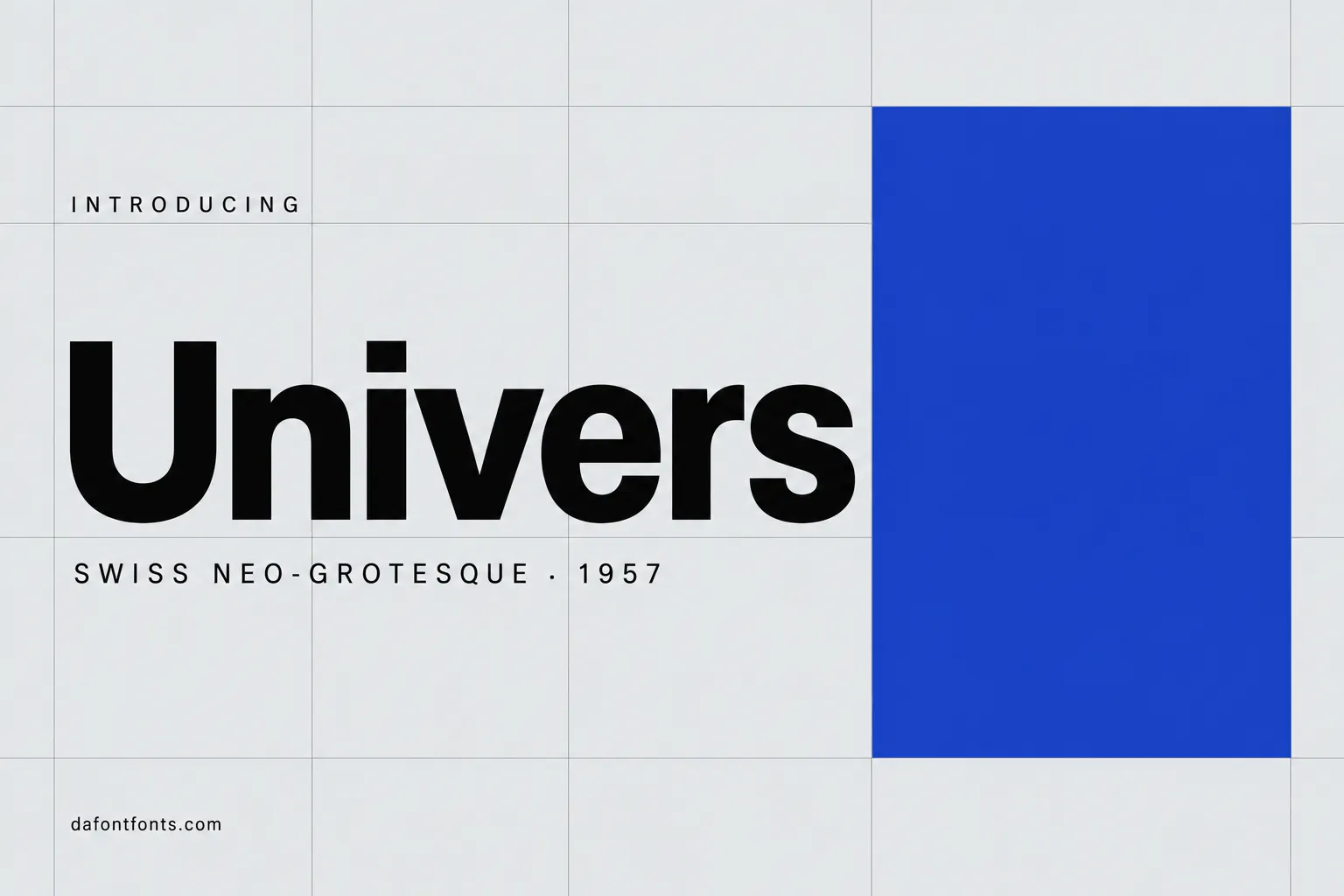

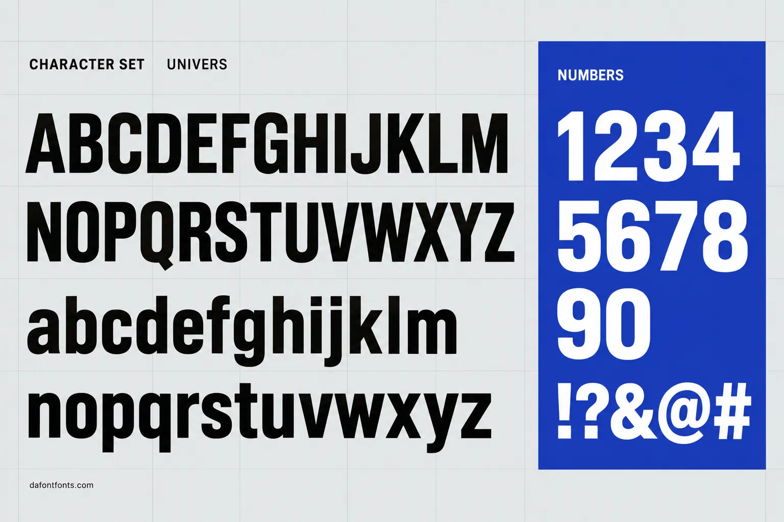
Illustrations of the Univers style made for DaFontFonts. Letterforms are approximate; check the official specimen before you buy.
Download Univers
- License:
- Paid license only
- Font Type:
- Paid
- Download:
- Free alternative: Archivo (OFL-1.1)
- Format:
- TTF
- Total Files:
- 18 styles + licence
Univers itself is not free to download. This button gives you Archivo, the closest free match, licensed for commercial use. Buy Univers on MyFonts
About Univers
Adrian Frutiger designed Univers for the French foundry Deberny & Peignot, which released it in 1957, the same year as Helvetica. Instead of drawing weights one by one, Frutiger planned 21 coordinated weights and widths from the start and gave each a two-digit number, so Univers 55 is the regular. That numbering idea was later copied across the industry.
Univers is a neo-grotesque like Helvetica, but cooler and more rational, with a slight contrast in its strokes and more open shapes. It became a favourite for corporate identity, signage and Swiss-style posters, and it is still used for transit systems, annual reports and technical documents.
Where Univers works best
- Corporate identity and reports
- Signage and wayfinding
- Swiss-style posters
- Technical and scientific documents
Free alternatives to Univers
Open-licence fonts with a comparable feel, every one verified free for commercial use and downloadable from DaFontFonts.
Archivo mirrors Univers's systematic ambitions with variable weight and width axes, covering condensed through expanded styles from one family. Its forms are squarer and more contemporary than Univers's disciplined curves.
Inter supplies the cool neo-grotesque neutrality of Univers with modern screen optimization and a full weight range. It lacks true width variants, the heart of the Univers system.
Roboto approximates Univers's slightly condensed, efficient grotesque texture, and Roboto Condensed extends it the way Univers's condensed widths did. Its apertures are more open, so it reads friendlier.
Chivo is a grotesque with firm, slightly squared forms and an even color that recalls Univers's engineered steadiness. It offers fewer widths and a warmer overall tone.
Heebo extends the Roboto skeleton into extra weights, giving a Univers-like range from thin to black in a neutral grotesque voice. Like most free options, it has no width axis.
Univers is a trademark of its owner. DaFontFonts does not host or distribute the Univers font files; download and licence links go to the official source.
Questions
Is Univers font free?
No. Univers is a paid Linotype family sold through Monotype. Archivo, Inter and Roboto are free alternatives with a similar clean neo-grotesque look.
What is the difference between Univers and Helvetica?
Both came out in 1957. Univers is more rigorously planned, with a numbered system of weights and widths, slightly more stroke contrast and more open letters. Helvetica is tighter and denser.
What do the numbers in Univers mean?
The first digit is the weight and the second is the width and posture. Univers 55 is the regular roman, and numbers go up for heavier or wider styles.
Who designed Univers?
Adrian Frutiger, who also designed Frutiger and Avenir, created Univers for Deberny & Peignot in 1957.
More popular fonts
- Boomhauer Font
- Gihun Font
- Hyper Font
- Johnny Pistolas Font
- Makayla Font
- Pirate Font
- Aadhunik Font
- Abuget Font
- Adelia Font
- Againts Font
- Alligator Font
- Alte Haas Grotesk Font
- Amalfi Coast Font
- Amarillo Font
- American Captain Font
- Ammanda Font
- Another Danger Font
- Autography Font
- Azonix Font
- Baby Blue Font
- Billabong Font
- Billy Ohio Font
- Birds of Paradise Font
- Black Jack Font
- Blackjack Font
- Boba Panda Font
- Bulletto Killa Font
- Caviar Dreams Font
- Cheri Font
- Chinese Rocks Font
- Cloister Black Font
- Collegiate Font
- Coolvetica Font
- Cream Cake Font
- Darloune Font
- Doctor Glitch Font
- Exmouth Font
- Fiesta Font
- Franklin Cascaes Font
- Freshman Font
- Ghastly Panic Font
- Happy Donuts Font
- Happy Moment Font
- Heading Pro Font
- Hello Font
- Hello Honey Font
- Himsomnia Font
- Hug Me Tight Font
- Jandles Font
- Journey Font
- KG Happy Font
- KG What the Teacher Wants Font
- Krinkes Font
- Lemon Milk Font
- Lucky Boss Font
- Macaroni Font
- Magical Font
- Money Money Font
- Muthiara Font
- Neuropol Font
- Noelan Font
- Nova Quinta Font
- Old London Font
- Orial Font
- Primetime Font
- Rainbow Dreams Font
- Raspoutine Font
- Respective Font
- Rumble Brave Font
- Samarkan Font
- Sareeka Font
- Showtime Font
- Signatie Font
- Stay Wild Font
- Storm Gust Font
- Sweets Smile Font
- The Skinny Font
- Top Secret Font
- Tripleta Font
- VCR OSD Mono Font
- Welcome Font
- Akira Font
- Algerian Font
- Arial Font
- Avant Garde Font
- Avenir Font
- Baskerville Font
- Bauhaus Font
- Benguiat Font
- Bodoni Font
- Brandon Grotesque Font
- Broadway Font
- Brush Script Font
- Calibri Font
- Canela Font
- Caslon Font
- Century Gothic Font
- Clarendon Font
- Comic Sans Font
- Cooper Black Font
- Copperplate Font
- Didot Font
- DIN Font
- Edwardian Script Font
- Eurostile Font
- Franklin Gothic Font
- Frutiger Font
- Futura Font
- Garamond Font
- Gill Sans Font
- Gilroy Font
- Gotham Font
- Helvetica Font
- Impact Font
- Minion Pro Font
- Museo Sans Font
- Myriad Pro Font
- Optima Font
- Papyrus Font
- Proxima Nova Font
- Rockwell Font
- Satoshi Font
- SF Pro Font
- Sofia Pro Font
- Tiempos Font
- Times New Roman Font
- Trade Gothic Font
- Trajan Font
- Verdana Font