Baskerville Font
John Baskerville's elegant 18th-century transitional serif
John Baskerville · Transitional serif · 1757 · ! Bundled with macOS and Office, premium cuts paid
Libre Baskerville · closest free match to Baskerville
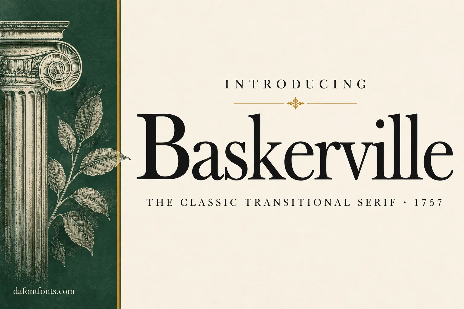
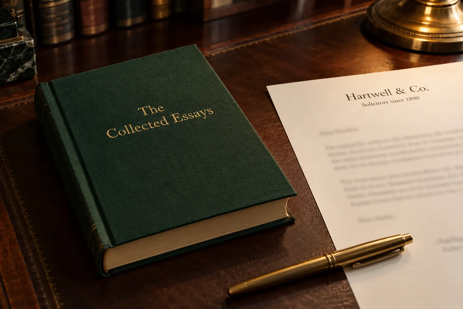
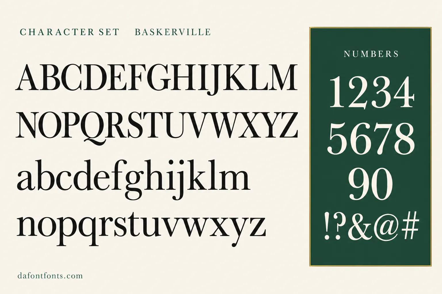
Illustrations of the Baskerville style made for DaFontFonts. Letterforms are approximate; check the official specimen before you buy.
Download Baskerville
- License:
- Bundled with macOS and Office, premium cuts paid
- Font Type:
- System font
- Download:
- Free alternative: Libre Baskerville (OFL-1.1)
- Format:
- TTF
- Total Files:
- 8 styles + licence
Baskerville itself is not free to download. This button gives you Libre Baskerville, the closest free match, licensed for commercial use. Buy Baskerville on MyFonts
About Baskerville
John Baskerville was a printer and businessman in Birmingham, England, who printed his famous edition of Virgil in 1757 with his own typeface. He pushed the contrast between thick and thin strokes further than earlier old-style types, sharpened the serifs and made the curves rounder and more vertical, creating what is now called a transitional serif. He also improved ink, paper and presses so the fine details would print cleanly.
Many revivals followed. Microsoft Office includes Baskerville Old Face, which Microsoft describes as the version first issued by the Fry foundry, under the name of its manager Isaac Moore. Apple ships its own Baskerville family on macOS. Its crisp, stately look makes Baskerville a favourite for book covers, academic publishing, formal stationery and brands that want to feel trustworthy and refined.
Where Baskerville works best
- Book covers and literary publishing
- Formal letterheads and invitations
- Editorial headlines
- Heritage and luxury branding
Free alternatives to Baskerville
Open-licence fonts with a comparable feel, every one verified free for commercial use and downloadable from DaFontFonts.
Libre Baskerville is a direct free revival, based on 1941 American Type Founders specimens and adjusted with a taller x-height for comfortable web reading. For body text it is the obvious choice.
Playfair Display draws on the same 18th-century transitional period at its most contrasted, ideal for the large headlines and mastheads where premium Baskerville display cuts are used.
Lora is a contemporary serif with moderate contrast that reads gracefully in long text, a softer, more modern take on the roles Baskerville fills in editorial design.
Spectral offers a transitional-flavored serif with a large weight range, useful for building a full editorial hierarchy the way premium Baskerville families do.
Libre Caslon Text is a loose match from the previous generation of English type: Caslon is the old-style face Baskerville's design reacted against, but the two share a period English character that works in similar projects.
Baskerville is a trademark of its owner. DaFontFonts does not host or distribute the Baskerville font files; download and licence links go to the official source.
Questions
Is Baskerville font free?
Mac users get a Baskerville family, and Office users get Baskerville Old Face, both for documents they create. Premium cuts are paid. Libre Baskerville is a free alternative licensed for any use, including websites.
Who designed Baskerville?
John Baskerville of Birmingham designed it in the 1750s and used it in his 1757 edition of Virgil.
What is Baskerville Old Face?
It is the Baskerville version included with Microsoft Office, based on the type first issued by the Fry foundry in the 1760s under the name of its manager, Isaac Moore.
What is a free alternative to Baskerville?
Libre Baskerville is the closest free option and is optimised for screens. Playfair Display works well for high-contrast headlines.
More popular fonts
- Boomhauer Font
- Gihun Font
- Hyper Font
- Johnny Pistolas Font
- Makayla Font
- Pirate Font
- Aadhunik Font
- Abuget Font
- Adelia Font
- Againts Font
- Alligator Font
- Alte Haas Grotesk Font
- Amalfi Coast Font
- Amarillo Font
- American Captain Font
- Ammanda Font
- Another Danger Font
- Autography Font
- Azonix Font
- Baby Blue Font
- Billabong Font
- Billy Ohio Font
- Birds of Paradise Font
- Black Jack Font
- Blackjack Font
- Boba Panda Font
- Bulletto Killa Font
- Caviar Dreams Font
- Cheri Font
- Chinese Rocks Font
- Cloister Black Font
- Collegiate Font
- Coolvetica Font
- Cream Cake Font
- Darloune Font
- Doctor Glitch Font
- Exmouth Font
- Fiesta Font
- Franklin Cascaes Font
- Freshman Font
- Ghastly Panic Font
- Happy Donuts Font
- Happy Moment Font
- Heading Pro Font
- Hello Font
- Hello Honey Font
- Himsomnia Font
- Hug Me Tight Font
- Jandles Font
- Journey Font
- KG Happy Font
- KG What the Teacher Wants Font
- Krinkes Font
- Lemon Milk Font
- Lucky Boss Font
- Macaroni Font
- Magical Font
- Money Money Font
- Muthiara Font
- Neuropol Font
- Noelan Font
- Nova Quinta Font
- Old London Font
- Orial Font
- Primetime Font
- Rainbow Dreams Font
- Raspoutine Font
- Respective Font
- Rumble Brave Font
- Samarkan Font
- Sareeka Font
- Showtime Font
- Signatie Font
- Stay Wild Font
- Storm Gust Font
- Sweets Smile Font
- The Skinny Font
- Top Secret Font
- Tripleta Font
- VCR OSD Mono Font
- Welcome Font
- Akira Font
- Algerian Font
- Arial Font
- Avant Garde Font
- Avenir Font
- Bauhaus Font
- Benguiat Font
- Bodoni Font
- Brandon Grotesque Font
- Broadway Font
- Brush Script Font
- Calibri Font
- Canela Font
- Caslon Font
- Century Gothic Font
- Clarendon Font
- Comic Sans Font
- Cooper Black Font
- Copperplate Font
- Didot Font
- DIN Font
- Edwardian Script Font
- Eurostile Font
- Franklin Gothic Font
- Frutiger Font
- Futura Font
- Garamond Font
- Gill Sans Font
- Gilroy Font
- Gotham Font
- Helvetica Font
- Impact Font
- Minion Pro Font
- Museo Sans Font
- Myriad Pro Font
- Optima Font
- Papyrus Font
- Proxima Nova Font
- Rockwell Font
- Satoshi Font
- SF Pro Font
- Sofia Pro Font
- Tiempos Font
- Times New Roman Font
- Trade Gothic Font
- Trajan Font
- Univers Font
- Verdana Font